
Founders who treat packaging as the final step in product development consistently underperform founders who treat it as a strategic pillar from the beginning.
The global skincare packaging market was valued at over $14 billion in 2023 and is projected to reach $22 billion by 2030, according to Grand View Research. That growth reflects how central packaging has become to brand differentiation in a category where formula parity is increasingly common. The packaging is often the only brand element that is consistent across every consumer encounter: retail, e-commerce, subscription box, unboxing, and daily use.
I approach skincare packaging from both sides of the brief. As a pharmacist, I read the formula first. As a creative director, I then build the packaging system around what the formula actually does and what the consumer actually needs to believe. That sequence matters, and this guide covers it from start to finish.
The Commercial Function of Skincare Packaging
Before the consumer reads a word of copy, before they try the product, the packaging makes a promise. That promise lives in the material, the finish, the weight, the color, the label hierarchy, and the tactile experience of picking it up. All of these elements communicate something about what the product is worth and whether the brand behind it knows what it is doing.
When packaging and formula are in alignment, there is a compounding effect. The packaging attracts the right consumer. The formula delivers on the packaging's promise. The consumer repeats. The brand builds equity.
When packaging and formula are misaligned, neither investment produces its potential return. A premium formula in cheap-feeling packaging loses the transaction. An overproduced package around an average product wins the transaction once and loses the customer forever.
The objective of skincare packaging design is not beauty. It is commercial accuracy: making the product look exactly as good as it actually is, at a price point that creates appropriate expectations, for an audience with a specific set of needs.
According to a 2023 IPSOS study, 72% of beauty consumers say packaging design influences their purchase decision. For a founder deciding where to allocate development budget, that number should reframe the conversation about what "essential" means.
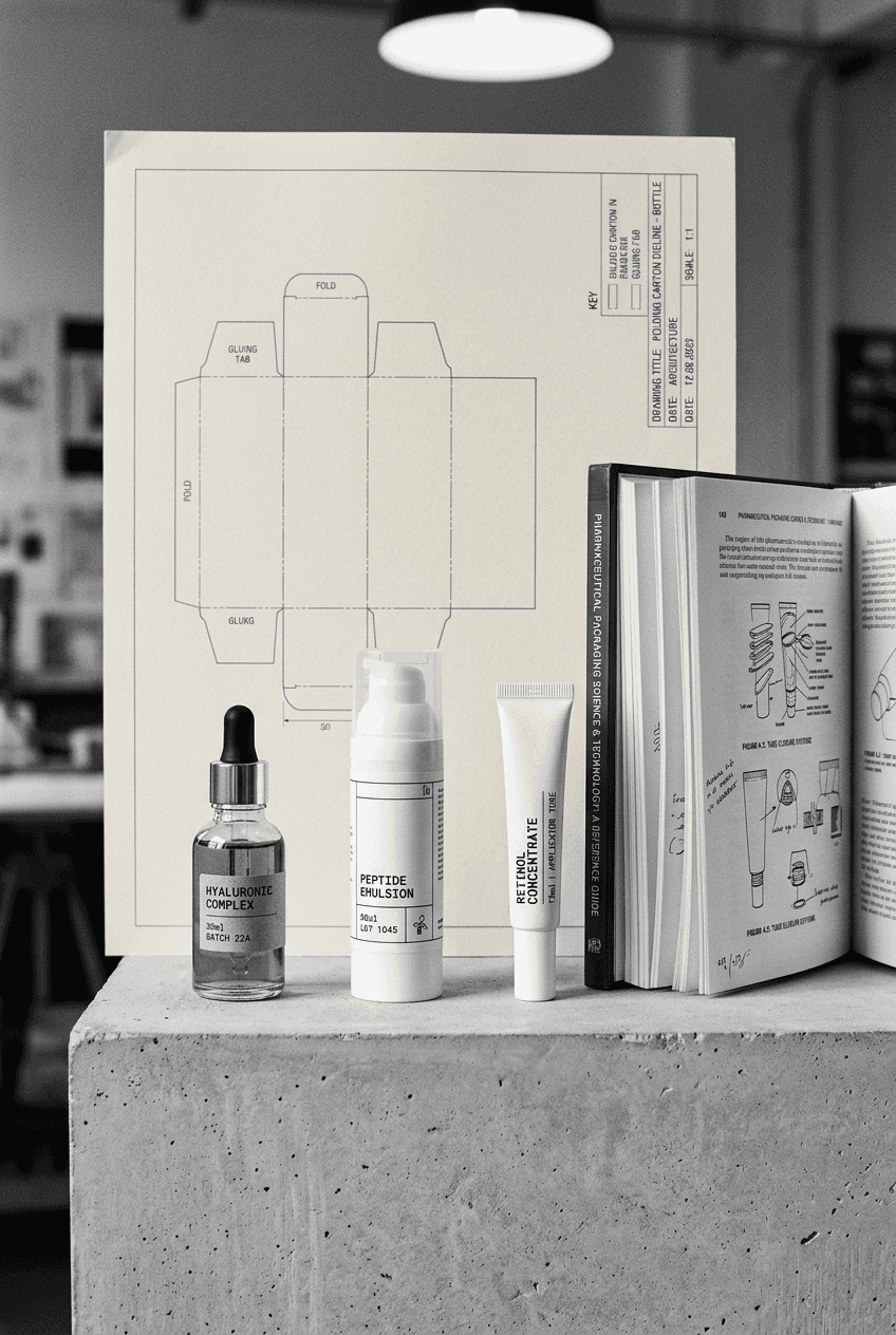
Material Choices: What Science and Market Both Require
Every material used in skincare packaging carries both practical and perceptual implications.
Glass is the prestige signal. Consumers associate glass with ingredient integrity, product purity, and premium positioning. For formulas containing actives that degrade with UV exposure or air contact, glass amber bottles provide functional protection that the consumer can see and feel.
The trade-offs are real. Glass breaks, and breakage rates in DTC shipping require engineering around the packaging to minimize returns and waste. Glass is heavier, which affects shipping costs at scale. For a brand selling predominantly through retail, these trade-offs are less significant. For a DTC-first brand, they require a deliberate cost-benefit analysis.
Airless pumps are the functional choice for formulas containing unstable actives: vitamin C, retinol, certain peptides, growth factors. The airless mechanism protects the formula from oxidation and bacterial contamination, extending shelf life and protecting efficacy. Consumers who understand formulation read this as evidence of a brand that takes its science seriously. HDPE and PET plastic bottles and tubes are the practical choice for mass-market and masstige positioning. They are lightweight, cost-effective at volume, and familiar to consumers across every channel. The perceptual risk is commoditization: this format is so ubiquitous that differentiation must come from label design, color, and claim rather than from the packaging structure itself. PCR (post-consumer recycled) and bio-based plastics are increasingly standard for brands speaking to sustainability-conscious consumers. The material choice becomes part of the brand narrative: the packaging is not just a container, it is evidence of the brand's values.
Material selection must be made in the context of the formula's chemistry. Some actives require specific pH or temperature stability that certain materials do not provide. These are not design questions. They are formulation questions that require scientific knowledge to answer correctly.
Format | Formula Suitability | Brand Signal | Price Positioning |
|---|---|---|---|
Glass dropper/bottle | UV-sensitive actives, oils | Premium, ingredient integrity | Prestige to masstige |
Airless pump | Unstable actives (vitamin C, retinol) | Clinical, science-forward | Mid to premium |
Tube (HDPE/PET) | Stable formulas, emulsions | Accessible, practical | Mass to masstige |
PCR/bio-based | Most stable formulas | Sustainable, values-led | Varies |
Refillable outer | Most formats | Premium, sustainable commitment | Premium |
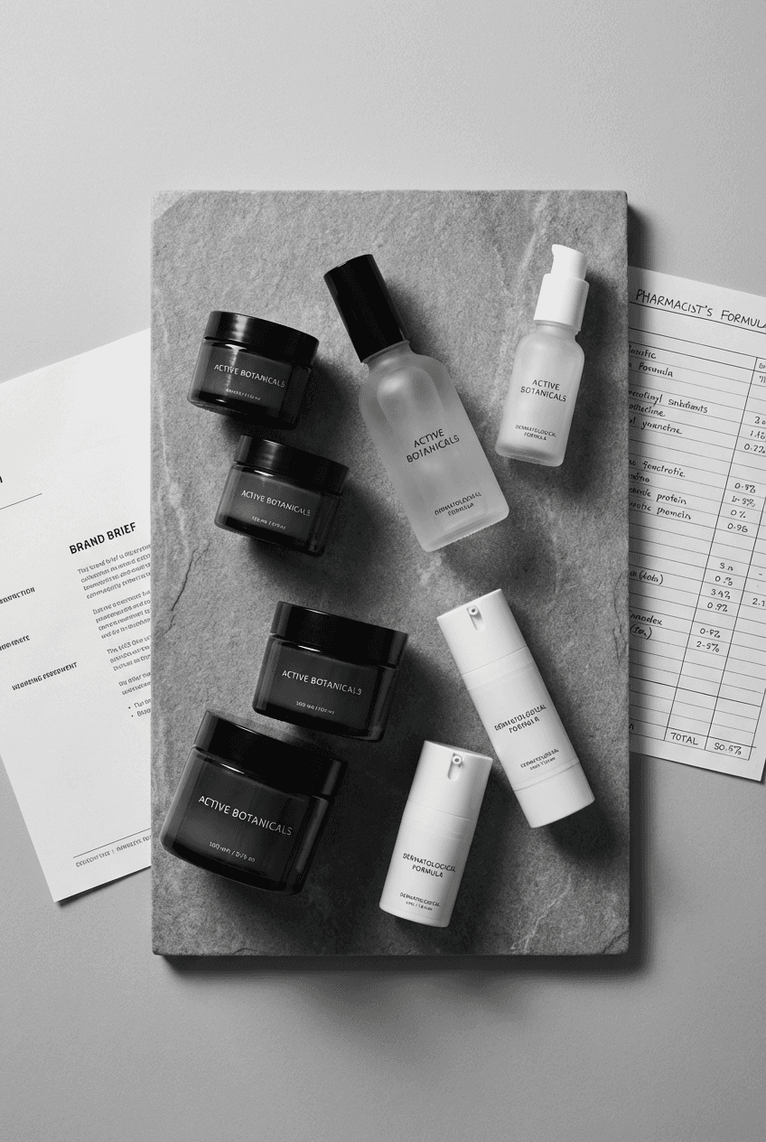
Label Hierarchy: The Art of Saying the Right Thing First
The most common label design failure in skincare is crowding the front of pack with too much information. Founders want consumers to know about the key ingredient, the clinical testing, the brand story, the sustainability commitments, and the usage instructions. All of this information matters. None of it belongs on the front of pack simultaneously.
The consumer's eye moves through a label in sequence. The brand name anchors the experience. The product name or category grounds the consumer in what they are holding. The key claim tells them why they should care. Everything else belongs on the back.
Specificity beats generality every time. "Visibly reduces fine lines in 14 days" outperforms "anti-aging moisturizer." The specific claim signals that the brand has evidence for the statement. It also creates a concrete expectation the consumer can verify, which builds trust when the formula performs.
Sensory language converts. "Melts into skin instantly" communicates texture in a way that "lightweight formula" does not. "Leaves no residue" addresses a specific fear that a consumer of facial oils might have. Good copy on a skincare label anticipates the objection and answers it before the consumer has to think of it.
The claim must also be honest. In most regulated markets, cosmetic claims must be substantiated and must not imply drug-like actions. Understanding what can be said, and how to say it compellingly within those boundaries, requires both regulatory knowledge and copywriting skill. I cover this in my guide to skincare packaging brief.
Claims Compliance: Where Most Brands Make Costly Mistakes
Skincare brands operate in a claims-regulated environment. In the EU, US, and most major markets, the distinction between a cosmetic and a drug is determined largely by the claims made about the product. A claim that implies a structural or physiological change to the skin crosses the cosmetic-drug boundary.
"Reduces the appearance of wrinkles" is a cosmetic claim.
"Rebuilds collagen" is approaching a drug claim.
"Stimulates collagen production" is a drug claim in most jurisdictions.
The distinction matters for two reasons. Regulatory compliance is obvious: a cosmetic making drug claims can be removed from market and subject to enforcement action. Brand integrity is less obvious but equally important: a brand that overpromises trains its customers to expect results the formula may not deliver, which erodes loyalty regardless of whether enforcement action follows.
The most robust approach to claims development starts with the formula. What does this ingredient actually do, at the concentration present in this formula, under the conditions of use? That question requires pharmaceutical or scientific knowledge to answer accurately. From that accurate answer, compelling and compliant language can be developed.
As a pharmacist, I approach claims the same way I approach a prescription review: the accuracy of the claim is not negotiable. What is creative is how to communicate that accuracy in the most compelling way within the boundaries of what can genuinely be substantiated.
Shelf Impact in Retail and Digital Environments
Skincare founders often design for the studio photograph and forget to test for the shelf. A label that looks exceptional in isolation may fail entirely in a retail context where it sits next to 40 competitors of similar color, similar format, and similar positioning.
In physical retail, the test is simple: place the prototype on a shelf with comparable products and step back. Can you identify the brand from three feet away? Does the key claim read clearly? Does the packaging communicate the correct tier of the market (mass, masstige, prestige) at a glance?
In digital retail, the test is equally simple: reduce the product image to the size it appears in a marketplace listing thumbnail. Does the brand name remain legible? Does the hero image communicate the product's positioning in that format? A packaging design that fails at 200 pixels wide will underperform in any channel where the thumbnail is the primary conversion touchpoint.
According to a 2024 NIQ report, skincare products with packaging that passes the thumbnail test, defined as clear brand identification and claim legibility at 150 pixels, convert at a rate 28% higher on e-commerce platforms than products where packaging detail is lost at small scale. Design for the worst case, not the best case.
I also cover how to present packaging across retail and DTC channels in my guide to beauty packaging trends 2026.
The Role of Formulation Knowledge in Packaging Decisions
The most persistent gap in skincare brand development is between the people who understand the formula and the people who design the packaging. Formulators and designers rarely speak the same language, and the brand brief that travels between them frequently loses critical information in translation.
When the person designing the brand or briefing the packaging understands what the formula does at an ingredient level, the decisions are different. The material choice reflects the formula's stability requirements. The claim is specific because the designer knows what the clinical data actually shows. The label hierarchy puts the right information first because the designer knows which ingredient or benefit will matter most to the target consumer.
I built my practice at this intersection. As both a pharmacist and creative director, I read the formula before opening a design file. That sequence, science first, then strategy, then design, produces skincare packaging that is beautiful, accurate, compliant, and built to sell.
Practical Decisions Before You Brief a Designer
Three decisions must be made before a packaging brief is written.
What is the product's primary channel? A product distributed through pharmacy channels has different shelf context and different consumer expectations than a DTC skincare brand or a high-end retail line. The packaging brief must be written for the channel, not in the abstract. What is the formula's key differentiator, and how will the packaging communicate it? If the differentiator is a patented delivery system, the packaging should reflect precision. If the differentiator is a rare botanical, the packaging should reflect nature and provenance. If the differentiator is clinical evidence at a specific concentration, the packaging should communicate scientific credibility. What regulatory markets will this product be sold in, and what are the mandatory labeling requirements? Build compliance into the brief from the beginning. A packaging design that has to be substantially revised after regulatory review costs time and money that could have been avoided.
Skincare packaging done well is a competitive asset. If you are at the brief stage and want to approach it correctly, reach out.
FAQ: Skincare Packaging
What is the most important function of skincare packaging?
Commercial accuracy: making the product look exactly as good as it genuinely is, at a price point that creates appropriate consumer expectations, for an audience with a specific need. Packaging that overpromises loses the repeat purchase. Packaging that underpromises loses the first transaction. Alignment between the packaging signal and the formula reality is the foundation of sustainable skincare brand growth.
Should I choose glass or plastic packaging for my skincare brand?
It depends on three factors: the formula's stability requirements, the brand's price positioning, and the primary channel. Glass communicates premium positioning and provides stability benefits for UV-sensitive formulas. Plastic is cost-effective and practical for mass and masstige brands. The material choice is a positioning decision as much as a practical one.
What is an airless pump and when should I use it?
An airless pump is a dispensing mechanism that eliminates air contact with the formula, extending shelf life and protecting unstable actives (vitamin C, retinol, peptides) from oxidation. Consumers who understand formulation read it as a quality signal. For brands that lead with ingredient science, an airless format communicates the brand's seriousness about its formula.
What information must appear on the front of a skincare label?
The front of pack must carry the brand name, product name or category, and the key commercial claim. Everything else, the full ingredient list, the regulatory declarations, the directions for use, belongs on the back. A front label that tries to communicate everything communicates nothing.
What is the difference between a cosmetic and a drug claim on skincare packaging?
A cosmetic claim describes an effect on the appearance of the skin. A drug claim implies a structural or physiological change to the skin or body. "Reduces the appearance of fine lines" is cosmetic. "Stimulates collagen production" is a drug claim in most jurisdictions. The distinction is regulated, and crossing it creates both legal and brand credibility risks.
How do I test my skincare packaging before launch?
Two tests: place the prototype on a physical shelf next to comparable products and evaluate it at retail distance. Then render the packaging as a marketplace thumbnail at approximately 150-200 pixels wide and evaluate whether the brand name and key claim remain legible. Both tests reveal problems that are invisible in studio photography.
How much should I budget for skincare packaging design?
A single SKU with primary and secondary packaging from a specialist designer typically ranges from $4,000 to $10,000. A full range with multiple formats and a complete packaging system ranges from $15,000 to $40,000. These figures are for design only, not production, mold tooling, or minimum order quantities. Attempting to compress this investment consistently produces packaging that undermines the brand's positioning.
I am Tambi, a brand strategist and creative director with an unfair advantage: I am a pharmacist. I run a creative studio for cosmetics, supplements and beyond. 17+ years. Exclusively.
Sources: Grand View Research, Global Skincare Packaging Market Report (2024); IPSOS Beauty Packaging Consumer Study (2023); NIQ E-Commerce Conversion Analysis (2024)