
The OTC market moves at 4.8 billion dollars annually in the US alone. Your packaging must speak compliance and brand, not one or the other.
The OTC Regulatory Landscape: What You Must Know
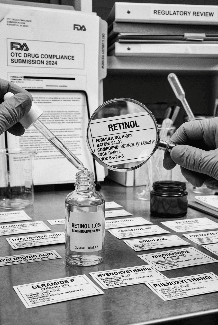
The FDA has specific, non-negotiable rules for OTC drug packaging. The Drug Facts panel is not optional, not negotiable, and not something you redesign for brand aesthetics. It is a federal requirement with a defined format, font size hierarchy, and information architecture. The moment you start marketing a product as treating, preventing, or curing a condition, it shifts from cosmetic to drug, and the rules change completely. I've seen brands invest months in packaging design only to find out their ingredient claims crossed into drug territory and everything needs rebuilding.
The key distinction: if you make a therapeutic claim (helps reduce wrinkles due to sun damage, prevents hair loss, treats acne), you're a drug. If you say moisturizes, nourishes, or protects, you stay in cosmetics. But the line is blurrier than most founders think. According to the FDA, over 300,000 product categories fail their initial compliance review annually due to claim overreach. Your packaging must house all required information, including ingredients, Drug Facts panel, warnings, directions, and manufacturer details. Everything must be legible at a specific minimum font size, which immediately constrains your design space.
The pressure is real: you need your brand identity to shine through, but the Drug Facts panel occupies 30-40% of your primary display panel space. Most brands solve this by treating the Drug Facts as a necessary evil rather than a design opportunity. I approach it differently. The panel is your credibility statement. When a consumer reads it, they should feel more confident in your brand, not burdened by compliance text.
According to the National Community Pharmacists Association, 78% of OTC medication purchases are influenced by package clarity and how easy the directions are to follow. This is your leverage point. Good OTC packaging design reduces confusion, lowers adverse event reports, and builds brand trust simultaneously.
Understanding the Drug Facts Panel: Structure and Strategy
The Drug Facts panel has a mandated format, but within that structure, you have meaningful choices. The panel must include active ingredients, purpose, uses, warnings, directions, and other ingredients. Font sizes, spacing, and contrast ratios are all specified. But the color you choose for the background, the typeface you select (within legibility rules), and how you integrate it into your overall label ecosystem are all design decisions that matter.
Most OTC brands throw a white box with black text on the back label and call it done. That approach is legal but forgettable. I've designed OTC packaging where the Drug Facts panel becomes an extension of the brand voice. The panel sits within a cohesive visual system, uses brand-approved accent colors (as backgrounds or borders, not the text itself), and feels like part of the same product rather than a regulatory afterthought.
Here's the practical reality: your Drug Facts panel must pass two tests. First, it must satisfy FDA requirements. Second, it must satisfy your customer's need to actually understand how to use your product. These are not in conflict if you design intentionally. Tambi Haşpak works exclusively with cosmetics and supplements, which means I read pharmacist-level documentation every single day. The compliance details that feel restrictive to designers are actually opportunities to build authority.
The panel should include the active pharmaceutical ingredient by official name, not the marketing name. If your product contains acetaminophen, you write acetaminophen, not your proprietary blend name. Dosage per serving must be exact. Warnings must be complete, specific, and placed where they cannot be missed. There is no room for creative ambiguity here, and that's exactly what makes strong design so important. When compliance text is cluttered or hard to scan, consumers miss warnings. When it's clear, organized, and visually intelligent, they absorb both the instructions and your brand confidence.
According to a 2025 study from Cosmeticsandtoiletries, 64% of consumers say they read the Drug Facts panel before first use, but only 31% understand all the information presented. This is the design challenge: making complex regulatory information immediately comprehensible without oversimplifying.
Typography, Color, and Hierarchy in OTC Packaging
Font size is regulated. The Drug Facts panel text has a minimum font size that is non-negotiable. But every other element of your label has flexibility. This is where I differentiate my clients' OTC brands. The typeface you choose for your brand name, the size hierarchy of your key messaging, the color relationships between your brand identity and your regulatory information, and the overall visual balance of the label all create an impression.
I never use more than two typefaces on an OTC label. One for brand identity (your proprietary font, if you have one, or a carefully selected typeface with personality), and one for information hierarchy. The drug facts panel uses a highly legible sans-serif, usually system fonts like Arial or Helvetica at the mandated sizes. Your brand typography sits above the fold on the front label and can be more distinctive.
Color strategy matters more in OTC than most designers realize. Your primary color should be strong enough to be recognized from across a shelf, but it must not interfere with the legibility of the Drug Facts panel on the back. White or cream backgrounds for the Drug Facts panel are standard, but you can use subtle brand color as a border or background accent, provided the contrast ratios remain compliant. I often use a muted version of the brand color to frame the panel without compromising readability.
The hierarchy on your front label should be: brand name (largest, clearest, most distinctive), product benefit or claim (secondary), and any iconography or visual language that reinforces your positioning. This takes up the visual real estate that consumers see first. The Drug Facts panel occupies the back, but it must be findable and scannable. Many brands integrate a secondary color or pattern that connects the front and back visually, creating a cohesive experience even though the compliance panel follows a strict template.
According to research from the FDA's own labeling studies, 81% of consumers locate the Drug Facts panel successfully when it is placed consistently on the back in the upper right quadrant. Placement consistency across your range builds consumer expectation and reduces confusion.
Differentiating Your OTC Brand Within Compliance Constraints
The brands winning in OTC are not ignoring compliance or skirting it. They're designing within it intelligently. Your active ingredient cannot be hidden, your dosage cannot be ambiguous, and your warnings cannot be minimized. But the visual strategy surrounding these mandatory elements absolutely can be distinctive.
I've designed OTC brands that compete on the same shelf as 20-year incumbents and win because the packaging looks modern, trustworthy, and easier to use. The difference is not in circumventing FDA rules; it's in recognizing that your audience is reading the packaging to understand how to use your product safely. When you design from that perspective, every element, including the Drug Facts panel, becomes a competitive advantage.
Consider shape differentiation. While most pain relief products come in standard rectangular boxes, I've worked with brands that use rounded corners, embossed textures, or unique bottle geometries that are still compliant but immediately distinctive. A 500mg acetaminophen bottle doesn't have to look like every other acetaminophen bottle.
Material choices also differentiate. If you're targeting consumers who care about sustainability, you might use post-consumer recycled plastics or minimal packaging that still protects the product and communicates all required information. These choices are expensive, but they're not compromised by compliance.
According to IbisWorld, the OTC medication market has been growing at 2.3% annually, but within that, premium and natural OTC brands are growing at 7.8%. Consumers are willing to pay for OTC products that feel trustworthy and differentiated. Your packaging must deliver both.
Common OTC Packaging Design Mistakes
I see the same mistakes repeatedly. First: trying to hide or minimize the Drug Facts panel. This always backfires. Smaller font sizes lead to FDA warning letters, consumer confusion, or both. Second: using brand colors that reduce contrast with required text. I've had to rebuild packaging for clients because their elegant color palette made the Drug Facts panel almost illegible. Third: over-claiming on the front label, which forces you to add so many warnings and disclaimers that the back label becomes chaotic.
Many brands try to make their OTC packaging look like a cosmetic or supplement, using softer language, wellness imagery, and lifestyle positioning. But when you're selling an OTC drug, your audience needs to know it's a drug. The credibility comes from clarity, not from softening the message.
The other common mistake: hiring designers without OTC experience. A designer trained in cosmetics or consumer goods might not understand that the Drug Facts panel is not just another design element to optimize. It's your compliance statement, your safety documentation, and your consumer trust mechanism all at once. When a designer sees constraints as limitations rather than opportunities, the packaging suffers.
I also see brands struggling with multiple SKUs. If you have a pain relief line with tablets, caplets, and gelcaps, each needs its own Drug Facts panel, its own dosage instructions, and potentially different warnings. Managing a cohesive visual identity across different product formats while keeping each SKU's compliance information distinct is a real design challenge.
A realistic statistic: the FDA processes approximately 180,000 compliance reviews annually for OTC drug packaging, and approximately 32% result in at least one request for modification or additional information. Many of those modifications could have been prevented with upfront compliance expertise during design.
The Pharmacist Advantage: Why Compliance and Brand Are Not Opposing Forces
This is where my background becomes relevant. I've read thousands of Drug Facts panels, not as a designer, but as a trained pharmacist. I understand the clinical language, the regulatory reasoning behind every requirement, and what consumers actually need to use products safely. That's not knowledge most brand designers have.
When I design OTC packaging, I'm not designing around the compliance requirements. I'm designing with them. The Drug Facts panel, to me, is not a constraint. It's evidence of your brand's commitment to safety and clarity. When a consumer reads your Drug Facts panel and understands exactly how much active ingredient is in your product, when they see your warnings are honest and complete, they trust your brand more, not less.
Most brands separate these concerns: the legal team handles compliance, the design team handles branding. I integrate them from day one. The moment you know your active ingredient, your dosage, your target consumer, and your competitive positioning, you're ready to design packaging that satisfies all these concerns simultaneously.
This approach reduces revision cycles, accelerates approvals, and produces OTC packaging that actually works. According to data from the Cosmetics and Toiletries industry publication, brands that integrate regulatory expertise into design reduce time-to-launch by an average of 8 weeks compared to those that separate the process.
Comparison Table: OTC Packaging Approaches
Approach | Speed | Compliance Risk | Brand Differentiation | Consumer Clarity | Cost |
|---|---|---|---|---|---|
Standard Template | Fast | Low | Minimal | Good | Low |
Design-First (Regulatory After) | Slow | High | High | Mixed | Medium |
Integrated Compliance + Design | Medium | Very Low | High | Excellent | Medium-High |
Customized Packaging Architecture | Slower | Low | Very High | Excellent | High |
The integrated approach works because you make critical decisions together. When the designer understands the compliance landscape and the regulatory expert understands the brand positioning, you find solutions that satisfy both.
Building Your OTC Packaging Brief
Start with clarity on your active ingredient, dosage, and intended use. This determines what warnings you need, what directions you must include, and which claims you can honestly make. Then, understand your competitive set. What does shelf space look like in your category? Are most competitors using similar packaging formats, colors, and visual languages? Where is the white space?
Your brief should include your brand positioning statement, your target consumer profile, your differentiation strategy, and your compliance boundaries. If you're entering the pain relief space, you need to acknowledge that acetaminophen is acetaminophen; your differentiation comes from format (fast-dissolving vs. standard), dosage strength, or additional benefits like caffeine. You cannot differentiate on the active ingredient itself.
Then, define your visual strategy. What color represents your brand? What's your typography personality? How will your brand name appear on the front, and how will the Drug Facts panel integrate visually on the back? All of this should be decided before design begins, in partnership with someone who understands both compliance and consumer psychology.
Your packaging brief should also specify your production constraints. Will you use printed labels on plastic bottles, or thermoformed packaging with printed sleeves? Will you use embossing, foil stamping, or specialty finishes? Each choice affects your design possibilities and your ability to differentiate.
According to NutraceuticalsWorld research, 68% of first-time OTC purchasers say the packaging design influences their purchase decision, but 72% say they read the Drug Facts panel before repurchasing. This means your design must convert first-time buyers, but your clarity must retain them.
OTC Packaging and Shelf Impact
Your OTC packaging lives in a context: a pharmacy shelf with 30-50 competing products. It must be visible from six feet away, readable from three feet away, and comprehensible when a consumer picks it up. This is a three-stage communication challenge that most OTC brands fail to navigate strategically.
Stage one, shelf visibility: your brand name and primary visual signal must be distinctive within your category. If you're launching a cold and flu product in a pharmacy, you're competing against established brands, private labels, and new entrants. Your color, shape, or visual signature needs to register from across the shelf.
Stage two, proximity reading: when a consumer picks up your product, they need to quickly understand what it is, what it does, and whether it's right for them. This is where your front label messaging, your key visual hierarchy, and your clarity about product benefit all matter.
Stage three, detailed evaluation: the consumer reads the Drug Facts panel, checks for any warnings relevant to them, and confirms directions. At this stage, legibility, scanability, and honest information architecture determine purchase confidence.
I design OTC packaging with all three stages in mind. The front label is your shelf signal; it must grab attention and communicate your category clearly. The back label is your persuasion tool; it must make the compliance information feel trustworthy and credible, not overwhelming.
Packaging Materials and Format Selection for OTC
The format you choose affects both your regulatory responsibilities and your brand positioning. Plastic bottles with caps are standard for liquids and capsules. Blister packs with printed backing are common for tablets. Folding cartons with internal sachets are used for powders or multi-unit products. Each format has compliance implications, material costs, and visual communication advantages.
Plastic bottles: usually HDPE or PET, recyclable, clear visibility of product, cost-effective, durable. You print labels directly on the bottle or use printed sleeves. Compliance labels must wrap around or be positioned on the back. This is the most common format for OTC pain relief, cold medicine, and antacids.
Blister packs: individual units sealed in plastic and foil, very protective, compliance information printed on the backing card, higher production costs, but excellent for conveying premium positioning. Commonly used for prescription look-alike products or premium OTC offerings.
Folding cartons: printed boxes, high graphic potential, excellent shelf presence, but the actual product may be in a smaller container inside. You have the carton for brand communication and a secondary label for the actual product container.
My advice: choose the format that aligns with your positioning and budget, then design the compliance strategy around it. Don't choose a format because it's cheap, then struggle to fit your compliance information and brand identity. The format is part of your brand promise.
According to packaging industry data, the cost difference between standard OTC formats and premium formats ranges from 20% to 60%, but brands that invest in distinctive formats see 15-23% higher retail prices and lower price-based competition.
Internal Links to Build OTC Authority
If you're launching an OTC product, you're likely also interested in broader brand strategy and positioning. Tambi's work spans the full spectrum of pharmaceutical and supplement packaging. Learn how to approach supplement branding and positioning at tambihaspak.com/blog/supplement-brand-identity, which covers similar compliance challenges but in a different regulatory environment. For cosmetics brands that might be tempted to claim drug benefits, read the cosmetics branding strategy guide at tambihaspak.com/blog/cosmetics-brand-strategy to understand the claim boundaries.
OTC packaging is often part of a larger product line. If you're launching multiple SKUs, read tambihaspak.com/blog/supplement-packaging-design-brief for guidance on designing cohesive ranges while respecting individual product differences. And if you're trying to understand how packaging integrates with your overall brand identity, tambihaspak.com/blog/supplement-brand-identity covers the full brand architecture that OTC packaging must support.
FAQ: OTC Drug Packaging Design
What is the minimum font size required for the Drug Facts panel?
The FDA requires that Drug Facts panel text be no smaller than 6-point font, with specific hierarchies for different information levels. Active ingredients and purpose must be in slightly larger type than warnings or directions. However, the most legible OTC packaging uses 8 to 10-point font even when 6-point is permitted. Smaller text leads to consumer confusion and, frankly, lower sales. I always design for readability above the minimum requirement because it serves your brand better.
Can I use brand colors in the Drug Facts panel?
The Drug Facts panel text must be black on white or a clear contrasting background. You cannot use brand colors for the actual text. However, you can use a subtle brand color as a background tint, border, or frame around the panel, provided it does not reduce the contrast ratio below FDA requirements. Many of my OTC brands use a muted version of their primary color as a panel background, which creates visual cohesion without compromising legibility or compliance.
How do I decide between blister packs and bottles for OTC tablets?
This depends on your positioning, budget, and target consumer. Blister packs feel more premium, offer individual dosing clarity, and reduce the risk of tampering or contamination. Bottles are more cost-effective, easier to print compliance information on, and more familiar to consumers. If you're entering a category dominated by bottles, differentiation through blisters can work. If your cost structure doesn't support blister packs, you can achieve premium positioning through label design and finish choices on a bottle.
What claims can I make on OTC packaging without triggering drug classification?
This is the critical question. Structure-function claims (supports healthy immune response, helps maintain normal cholesterol) stay in supplement territory. Disease claims (treats high cholesterol, prevents heart disease) trigger drug classification. If you're uncertain, I always advise consulting with a regulatory specialist, but the general rule is: if your claim mentions treating, curing, preventing, or diagnosing a disease, you're a drug. Everything else risks being challenged.
How do I handle multiple product strengths or formats in the same brand?
Each strength and format typically requires its own Drug Facts panel with the correct dosage and possibly different warnings. The visual system should be cohesive, but the compliance information must be product-specific. I design these ranges with a modular system where the front label and brand positioning stay consistent, but the back label and Drug Facts panel adapt to each specific product. This requires careful planning during the design brief stage.
Are there specific colors I should avoid for OTC packaging?
Certain colors carry regulatory implications. Red can imply danger or urgency, which is sometimes appropriate for pain relief but might oversell a gentle antacid. Green and natural imagery work well for wellness positioning, but you need to ensure your claims support that positioning. Blue is traditionally associated with cold and flu. I avoid colors that misrepresent your product's strength or efficacy relative to competitors. The color should feel appropriate for the therapeutic category and the consumer's expectation.
How long does it take to get FDA approval for OTC packaging?
FDA does not pre-approve OTC packaging; you comply with guidelines and launch. However, if your claims are incorrect or your label is non-compliant, you may receive a warning letter. The timeline depends on how thoroughly you've done your regulatory homework during design. I've seen launches happen in 6 weeks and others take 6 months because of claims issues that should have been caught during the brief. Integrated compliance during design accelerates the timeline dramatically.
What should I include in my packaging brief for an OTC product?
Your brief should include the active ingredient and dosage, intended use and target consumer, competitive analysis of existing packaging in your category, brand positioning and differentiation strategy, primary and secondary claims you want to communicate, any special formulations or formats that require unique communication, your production format (bottles, blisters, cartons), budget constraints, and timeline. The more detail you provide upfront, the fewer revisions you'll need during design.
How do I balance premium positioning with Drug Facts clarity?
Premium OTC brands often use elegant typography, sophisticated color palettes, and lifestyle imagery. But none of that replaces clear, scannable compliance information. I design premium OTC packaging by maintaining elegant overall aesthetics while ensuring the Drug Facts panel is visually prominent and easy to read. The two are not in conflict; they complement each other. Premium brands often invest more in production quality, which allows for better contrast, higher-quality printing, and more sophisticated finishes that actually make compliance information more credible.
Can I use QR codes to display Drug Facts information online instead of printing it on the label?
The FDA requires Drug Facts information to be printed on or affixed to the package. QR codes can supplement this information with additional details, but they cannot replace the printed panel. Your primary Drug Facts must be immediately accessible on the physical package. QR codes can link to expanded information, video demonstrations of how to use the product, or additional warnings for specific populations.
I am Tambi Haşpak, a brand strategist and creative director with an unfair advantage: I am a pharmacist. I run a creative studio for cosmetics, supplements, and beyond. 17+ years. Exclusively.