
A vague brief produces vague work. A specific brief produces designs that sell.
Why Cosmetics Brands Need Better Briefs Than Other Industries
The cosmetics industry moves at a different speed than other categories. A clothing brand can iterate quarterly. A cosmetics brand often needs packaging, labeling, and point-of-sale materials ready to launch simultaneously. There's no time for "let's try something and see how it tests." Your brief needs to be precise enough that a designer working from it produces work you'll love on the second or third revision, not the seventh.
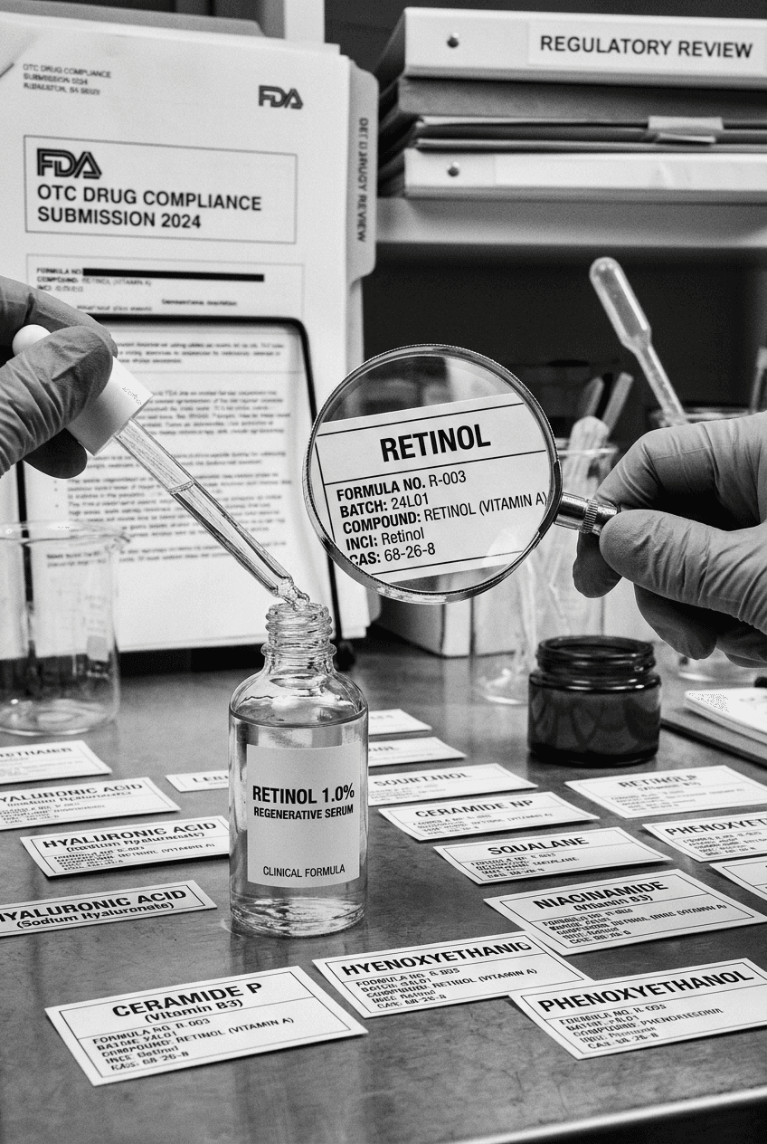
Additionally, cosmetics are visual categories. Consumers make purchase decisions in seconds, based entirely on packaging appearance. Unlike a software product where users can learn the interface over time, cosmetics consumers make up their mind before they even open the product. Your brand brief directly influences whether the packaging triggers a purchase or triggers scroll. According to a 2024 Mintel report, 58% of cosmetics consumers cite packaging design as their primary influence on purchase intent, ahead of price and even ingredients. That means your brief is carrying revenue weight.
I also see briefs fail when they're written from the founder's internal perspective rather than the designer's external perspective. The founder knows what the brand means to them. But the designer needs to understand what the brand means to a consumer who has never heard of the brand before. That shift in perspective changes what needs to be in the brief.
The Core Problem With Most Cosmetics Briefs
I've seen hundreds of briefs. Most follow this pattern: "We're a luxury skincare brand focused on natural ingredients and sustainability." That's not a brief. That's a category sentence. A designer reading that has no more information than they did before. Are you 1990s Estee Lauder luxury or 2026 indie luxury? Is natural ingredients your differentiator or your baseline expectation? Does sustainability mean only organic, or does it include sustainable manufacturing practices? Are you targeting Gen Z or affluent women aged 45+?
The second problem is vague language. "Clean aesthetic," "premium feel," "modern vibes." These words mean something different to every designer. One designer's "modern" is another's "dated." Without specificity, you're gambling.
The third problem is briefs that are too long. A 40-page brief drowns critical information in noise. Designers won't read it. If they do, they'll misremember the important parts. A brief should be dense with information but brief in length.
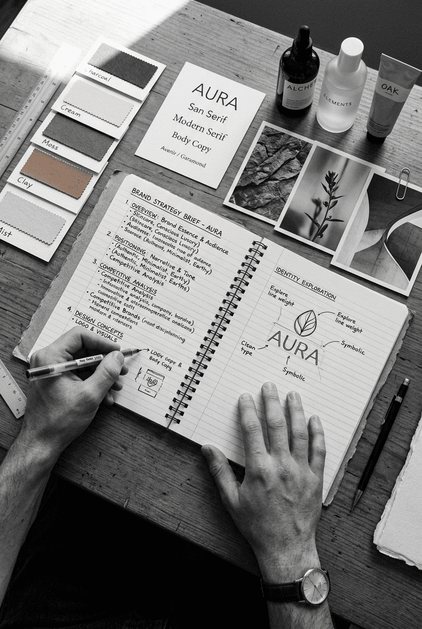
The Template I Send Every Cosmetics Client
Here's the exact structure I use, with annotations explaining why each section matters.
SECTION 1: ONE-SENTENCE POSITIONING STATEMENT
"We make luxury skincare for women aged 30-50 who believe prevention is better than correction, are willing to pay for results, and distrust mass-market brands."
Why this works: This is not marketing copy. This is your north star for every design decision. Everything the designer creates should ladder up to this statement. If a design doesn't support this positioning, it gets cut. A positioning statement clarifies who you're for, why they buy, and what alternative you're replacing.
SECTION 2: THE PROBLEM YOU SOLVE
"Women aged 30-50 are caught between drugstore skincare that feels cheap and high-end skincare that feels performative and elitist. They want science-backed products, transparent ingredients, and reasonable pricing. Currently, they compromise by buying drugstore plus one splurge luxury product, or they give up and use whatever is available."
Why this works: This shows the designer the real human problem you're solving. It's not abstract. The designer can now make visual decisions that support this insight. They'll choose accessibility and transparency in the visual language, not intimidation and exclusivity.
SECTION 3: WHO SPECIFICALLY IS YOUR CONSUMER
Include: Age range, income level, lifestyle, media consumption, shopping behavior, and what competitor brands they currently use. Be specific about contradictions. "She reads Architectural Digest for inspiration and listens to true crime podcasts. She shops at Whole Foods and Target. She owns one luxury handbag and three good canvas totes. She Googles ingredients before buying but doesn't use TikTok."
Why this works: Designers need to visualize who they're designing for. This level of specificity helps them understand the consumer's values, taste level, and sophistication. You're not designing for your idea of who should buy your product, you're designing for the real human who will actually buy it.
SECTION 4: BRAND PERSONALITY IN THREE TO FIVE WORDS
Don't use generic words. Instead of "premium," say "authority-based." Instead of "natural," say "botanically-sourced-but-science-backed." Instead of "clean," say "transparent-about-trade-offs."
Examples: "Intelligent, understated, non-dogmatic." Or "Bold, unapologetic, inclusive." Or "Clinical-with-warmth, modern-not-trendy, accessible-not-cheap."
Why this works: These words should describe how your brand talks, what it stands for, and how it treats the consumer. They're not style descriptors, they're personality descriptors. A designer can translate "intelligent, understated, non-dogmatic" into color, typography, and imagery that reinforces that personality.
SECTION 5: VISUAL REFERENCES
Include 5-7 brand examples, products, or images that represent the visual direction you want. These can be competitor brands, non-competitor luxury brands, fashion brands, hospitality brands, or even art and photography. Include why each reference matters.
Example: "Augustinus Bader packaging (reason: understated luxury, readable white space, scientific typography). Byredo imagery (reason: sophisticated and sensual without being dark or heavy). Aesop visual language (reason: small typography, trust through detail, accessibility within premium positioning)."
Why this works: Visual references eliminate vagueness. A designer can see exactly what aesthetic you're pointing toward. This is more useful than saying "we want luxury" because the references show your specific interpretation of luxury.
SECTION 6: COLOR DIRECTION
Don't just list colors. Explain the strategy. Example: "Primary color: warm white (not pure white, because that feels clinical and cold). Secondary color: deep sage green (natural ingredients, unisex appeal, premium positioning). Accent color: warm gold only for foiling or premium tier products. Avoid: anything pastels, anything neons, anything that signals 'skincare for teenagers.'"
Why this works: Colors carry meaning. If you just say "use greens," the designer might choose lime, sage, forest green, or seafoam. Those are completely different. Explaining your strategy means the designer makes color choices that are actually strategic, not arbitrary.
SECTION 7: TYPOGRAPHY GUIDANCE
Specify serif, sans-serif, and whether you want something distinctive or something safe. Include examples of typefaces that represent the direction (even if you don't mandate they use those specific faces). Example: "Primary typeface should feel: modern and clean, but not corporate. Similar personality to Gotham (friendly-modern) not Helvetica (corporate-modern). Secondary font can be serif, but must feel contemporary, not traditional. Similar to Lyon or Crimson Pro, not Times New Roman."
Why this works: Typography carries more meaning than most founders realize. Serif fonts signal tradition and expertise. Geometric sans-serifs signal modernity and accessibility. Humanist sans-serifs signal warmth. The designer needs to understand what emotional response you want the typography to trigger.
SECTION 8: WHAT TO AVOID
Be explicit about what you don't want. "Avoid: florals, pastels, scripts, anything that codes as 'spa,' feminine decorative elements, photorealism, anything that makes this look like MLM skincare."
Why this works: Designers need constraints. Without knowing what to avoid, they'll occasionally explore directions that completely miss your brand. Being explicit about avoid items saves revisions.
SECTION 9: SPECIFIC PACKAGING CONSTRAINTS
Include: bottle or container type (glass, plastic, airless pump, jar), label size and shape, printing methods (flexo, digital, foil), any regulatory requirements, and where this product will be sold (e-commerce only, Target shelf space, luxury boutique). Example: "Airless pump bottle, 50ml. Label wraps around 2.5 x 3 inches. Flexographic printing, no special effects. Must include: ingredient list, warning, SPF claim (if applicable). Sold direct-to-consumer and on Sephora."
Why this works: Designers sometimes create labels that look great in presentation but can't actually be manufactured on your chosen packaging or with your chosen production method. Being specific about constraints prevents expensive design revisions later.
SECTION 10: LAUNCH TIMELINE AND BUDGET
"Concept development: two weeks. Design direction: one week. Refinement: two weeks. Production files: one week. Timeline dependent on revision rounds. Budget: $X for logo and packaging design, Y for label design, Z for POS materials."
Why this works: Designers need to know your timeline and budget so they can scope their work appropriately. A tight budget might mean fewer revision rounds. A tight timeline might mean the designer needs to focus only on core items (logo and primary packaging) and save secondary items for later.
How to Use This Template
Once you've filled out all ten sections, share it with your designer. In the first call, review it together. Ask the designer what sections are clear and what sections need elaboration. Let them ask clarifying questions. A good designer will identify gaps you didn't know existed.
Then, set revision expectations clearly: "You'll present three design directions. We'll give feedback. You'll present refined versions based on feedback. We'll do one final round of adjustments before production files." This prevents the "unlimited revisions" situation where projects never end.
Most cosmetics brands spend between $2,500 and $6,000 on a complete packaging design project when they have a clear brief. Without a clear brief, those same projects take 3-4 times longer and often end in frustration.
The Difference Between a Brief and a Creative Feedback Round
I see founders confuse the brand brief (your strategic north star) with creative feedback (your thoughts on a specific design). These are different things. The brief is written once, at the beginning. Creative feedback happens during revisions.
When you give feedback on design concepts, reference back to the brief. Don't say "I don't like this direction." Say "This direction doesn't align with our positioning statement that we're authority-based and transparent. Let's explore a direction that feels less intimidating."
This approach prevents scope creep and keeps the conversation strategic instead of personal. The designer isn't wrong, the direction just doesn't ladder up to the brief you agreed on.
Comparison Table: Vague Brief vs Specific Brief
Element | Vague Brief | Specific Brief |
|---|---|---|
Positioning | "Luxury skincare" | "Luxury skincare for women aged 30-50 who distrust mass-market brands and want science-backed claims" |
Aesthetic Direction | "Modern and clean" | "Modern but not corporate, similar to Byredo not Glossier" |
Consumer Profile | "Women aged 30-50" | "Women 30-50, Whole Foods shoppers, true crime podcast listeners, $75K+ income, reads Vogue not TikTok" |
Color Strategy | "Greens and whites" | "Warm white (not pure), deep sage green, gold accents only for premium tier, no pastels" |
Typography | "Clean typeface" | "Geometric modern sans-serif like Gotham personality, not Helvetica. Secondary serif similar to Lyon." |
Revision Rounds | 7-12 rounds needed | 2-3 rounds sufficient |
Design timeline | 8-12 weeks | 4-6 weeks |
Designer confidence | Low, guessing at intent | High, clear direction |
Common Brief Mistakes to Avoid
Mistake 1: Treating the brief like marketing copy. Your brief isn't for consumers, it's for designers. Don't use the language you'd use in advertising. Be specific and strategic instead. Mistake 2: Not including competitor references. Competitors give designers immediate context. Say "our positioning is between Aesop and Drunk Elephant" and a designer immediately understands price tier, aesthetic direction, and consumer profile. Mistake 3: Using only internal language. If you say "this should feel like what our founder's grandmother would use," the designer has no reference point. Translate internal language into external examples or reference points. Mistake 4: Asking designers to be brand strategists. Your brief should answer "who are we and why do consumers buy us." Don't make the designer figure out your positioning. If you haven't figured it out yourself, that's a bigger problem than the design. Mistake 5: Not specifying what to avoid. Most briefs only say what to do. Great briefs also clearly state what not to do. This prevents the designer from exploring directions that miss the mark. Mistake 6: Changing the brief during the design process. If you're changing your positioning mid-project, stop and write a new brief. Don't layer new strategic direction on top of ongoing design work. It confuses everything.
When to Revise Your Brief
You don't need a new brief every season, but you should revisit and refresh your brand brief whenever:
You're launching a new product category (skincare, body care, color cosmetics).
Your consumer has shifted significantly (moving upmarket, moving downmarket, or targeting a different age group).
Competitive landscape has changed dramatically.
Your positioning has evolved based on real market feedback.
You're rebranding or refreshing your visual identity.
For detailed guidance on the full rebranding process, see our post on cosmetics rebranding. If you're building your complete brand identity system beyond packaging, check out cosmetics brand strategy for how a brand brief integrates into larger strategic planning.
For packaging-specific briefs and how to write a brief that a manufacturer can actually execute, read our guide on cosmetic packaging design.
FAQ: Brand Briefs for Cosmetics
Q: How long should a brand brief actually be?
A: 2-4 pages is ideal. Any longer and designers won't read the whole thing. Any shorter and you're missing critical information. A brief should be dense with information but short in length. Every section should earn its place.
Q: Should my brand brief include pricing strategy?
A: Yes, indirectly. Your designer should know if this is a $12 drug store product or a $120 prestige product, because that information changes every design decision. But you don't need to share your exact margin or profit targets. Just say "this positions at prestige price tier" or "this competes in the $15-25 range."
Q: Do I need a different brief for each product in my line?
A: Not necessarily. You can have one master brand brief that applies to all products, and then product-specific briefs that add detail for individual items. Example: master brief covers brand positioning and visual system, but each product brief covers the specific benefit claim, target demographic nuance, and any product-specific positioning that differs from the master brand.
Q: What if I don't agree with my designer's interpretation of the brief?
A: Go back to the brief. Show them the specific section where you disagree. Most disagreements come down to different interpretations of vague language. If the designer's work actually aligns with what the brief says, then the issue is that the brief itself wasn't specific enough. Don't blame the designer, improve the brief.
Q: Should I include my brand voice/tone guide in the brief, or is that separate?
A: If you have a separate brand voice guide, reference it but don't duplicate it. A brief focuses on strategy and visual direction. Voice and tone belong in a separate asset. However, if you don't have a voice guide yet, include personality words in your brief that help the designer understand the tone. "Intelligent and non-dogmatic" conveys tone that affects visual decision-making.
Q: How do I brief a designer if I don't have a clear positioning yet?
A: This is a red flag. Stop. Do not hire a designer yet. Work with a brand strategist to clarify your positioning first. A designer can create beautiful packaging around unclear positioning, but it won't sell. You'll end up with something that looks good but doesn't communicate who you're for or why anyone should buy. For detailed guidance on this foundational work, see our post on cosmetics brand strategy.
Q: Can I use the same brief for a logo designer and a packaging designer?
A: Yes, with one addition. Give both designers the same brand brief, but also create a section that explains how the logo will be integrated into packaging. Will the logo be the centerpiece of the label, or will it be a small mark? Will the logo be used in color, or primarily as a mark? This packaging-specific detail ensures the logo and label work together as a system.
Q: What if my designer pushes back on my brief and says something is impossible?
A: Listen. Sometimes what looks good in a brief is actually impossible to execute on real packaging due to printing constraints, cost, or technical requirements. Example: you might want a foil accent on every label, but if you're printing 10,000 units on a small budget, that might be cost-prohibitive. Work with the designer to find the visual direction that's achievable within your constraints. The brief is strategic direction, not a technical specification.
I am Tambi Haşpak, a brand strategist and creative director with an unfair advantage: I am a pharmacist. I run a creative studio for cosmetics, supplements and beyond. 17+ years. Exclusively.